2021-06-18
The Political Infographic on Instagram: A Comparative Study of Left and Right Aesthetics in the United States
Publication
Publication
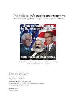
Amidst the rise and fall of former US President Donald Trump and the strong cultural and political backlash that ensued, a new form of political messaging flourished in the digital landscape of the social-networking application Instagram: the infographic. The infographic, a blended textual-visual format which presents concise bits of information, emerged with the birth of the modern-day newspaper. Today, however, during a period of high political polarization in the US, the political infographic has flourished on Instagram. In our digital age, the infographic is well-suited to the needs of an image-hungry, fast-moving public. They are widely created and shared by Instagram users and, in the event of a political scandal, they proliferate overnight. In text, the infographic offers information in the form of facts and figures, quotations from public figures, or simply moralistic statements. An infographic is nothing, however, without its visual dimension. It can therefore be considered as an aesthetic medium, one which pairs text and image in order to quickly and sensationally convey a political message. In the context of US politics, Instagram infographics typically fall into one of two broad groups: the left and the right. This research determines if and to what extent Instagram infographics from each group differ in aesthetics. Moreover, this study explores what this says about the aesthetic preferences of each group. Using qualitative visual content analysis, this research analyzed 100 infographics from the political left and right respectively for a total of 200 infographics. It found that the two political camps differ in three broad ways: in their color schemes, their usage of photographed persons, and in their use of the multi-slide feature, a function which allows several images to be posted as part of one infographic. While the left uses largely light color palettes, black & white photographs of people, and makes heavy use of the multi-slide feature, the right generally uses dark color palettes, colored portraits of people, and mostly uses the single-slide format. Further, analysis produced twenty aesthetic categories into which the aesthetic categories can be grouped. While the left was found to favor categories Light & Bright, Minimalist, and New Age, the right showed a preference for categories Straightforward & Personal, Patriotic, and Enemy. The preferences of each group not only reveal the proclivities and values of each, but also offer useful knowledge for successful visual campaigning techniques going forward.
| Additional Metadata | |
|---|---|
| , , , , | |
| Julia Peters | |
| hdl.handle.net/2105/60961 | |
| Master Arts, Culture & Society | |
| Organisation | Erasmus School of History, Culture and Communication |
|
Julia Pompilius. (2021, June 18). The Political Infographic on Instagram: A Comparative Study of Left and Right Aesthetics in the United States. Master Arts, Culture & Society. Retrieved from http://hdl.handle.net/2105/60961 |
|